City Of Belongings
“City of Belonging” is an augmented reality-powered mobile application, revolutionizing the way individuals from diverse cultural backgrounds navigate new territories. Designed to empower and connect, this app embarks users on enriching journeys, fostering a profound sense of belonging while seamlessly bridging cultures and nurturing a supportive global community for those embarking on new country experiences.
Oct 2022 - Apr 2023
Individual Project
Skills:
Product Design, Design Research, Concept Development, Design Engineering, Programming, 2D/3D Prototyping, Interaction Design, Visual Design
Tools:
Figma, Sketch, Lens Studio, Adobe Creative Suite, Mirro

Problem
Living as an expatriate in the multicultural city of New York and in Abu Dhabi, my own living experiences and my interactions with the diverse community led me to ask:

How might we help immigrants better connect with their new urban environments and build a strong sense of belonging in the city?
Design Solution
A mobile application featured with interactive Augmented Reality (AR) experience.


Key Design Features


Social Connections and Cultural Exploration


-
Track and visualize individual city exploration journeys through variety of ToDo Lists.
-
Cultural calendar and event listings encouraging culturally significant activities.
-
Community Building through various group chats and social events.


-
Overlay local cultural insights (historical / mythology / nostalgia elements) and the user's cultural background with urban landscapes.
-
Enhanced emotional connections by linking user generated content of shared experience to city landmarks during AR navigation.
-
Narrate stories highlight architectural and cultural elements of the city.
Cultural Bridging through Interactive Augmented Reality

Map-Based Memory Storage & Personal Navigation

-
Layers cultural and personal memories over geographical maps, fostering a macro perspective of the city.
-
Tailored Navigation routes with personal preference choices encouraging urban engagement.
-
Place-making through users interacting with memories tied to specific geographic locations.
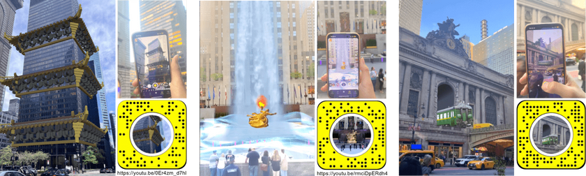
AR Feature Demo Video
Design Process
Literature Review
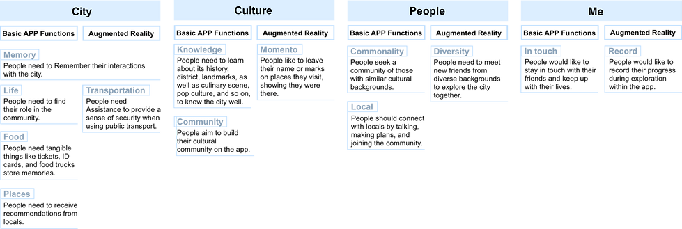
Deconstructing “City Perception” into 3 Aspects:
City, People, and Culture

Acculturation complexity model (ACM)

Ettehad, Sheida, et al. “The Role of Culture in Promoting Architectural Identity.” European Online Journal of Natural and Social Sciences: Proceedings, vol. 3, no. 4, 2014.
Décieux, Jean Philippe, and Elke Murdock. “Sense of Belonging: Predictors for Host Country Attachment among Emigrants.” IMISCOE Research Series, 2021, pp. 265–285, https://doi.org/10.1007/978-3-030-67498-4_15.
Main Insights from Survey and Interviews
Defining "Sense Of Belonging"

Design Logic

Affinity Diagram
User Persona


Design Solution

App User Flows


AR Design
Design Logic


Design Demo
I designed the AR demo with NYC as a demo place and my Chinese Identity as the demo user for the app. The three scenes are designed to connect the two culture through city landmark and historical Architecture, mythology, and nastolgical. transportations

UI Design
Color Palette
Theme

Greyscale

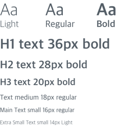
Typography
UI Components


Final Outcome
Final Outcome
AR Experience
App Design

Usability Tests and Performance Metrics
Usability testing is conducted from several aspects, including task completion, UX interaction, visual experience, design goals achievement, competitor comparison, and AR experience. Some selected data are as follows:

Challenges and Takeaways
1. Defining "Belonging" – A Subjective and Cultural Concept
📌 Challenge:
Belonging is an abstract social psychology concept with varying interpretations. Different users have distinct perspectives influenced by their personal experiences, biases, and cultural backgrounds.
✅ How I Addressed It:
-
Conducting in-depth surveys and interviews to identify the key themes that users associate with belonging.
-
Categorizing research findings to establish a clear design direction while making trade-offs to maintain focus.
-
Understanding cognitive biases—users’ perceptions varied significantly, sometimes even contradicting each other.
🎯 Lesson Learned:
Instead of assuming a universal definition, I needed to structure research insights to guide the design architecture. A systematic approach to user research is key to uncovering patterns in an otherwise subjective topic.
2. Managing Information Overload in Map Design
📌 Challenge:
The initial map design was too complex, attempting to integrate social dynamics, location recommendations, and navigation all in one view. This resulted in information overload, making it difficult for users to find what they needed.
✅ How I Addressed It:
-
Introduced layered visibility, allowing users to toggle between different modes (social/exploration/navigation).
-
Improved visual hierarchy by using color coding and progressive disclosure to highlight critical information.
🎯 Lesson Learned:
Design needs to prioritize clarity. Users should not have to "decode" the interface—hierarchical structuring helps them focus on what matters most.
3. Importance of Usability Testing during Decision Making
📌 Challenge:
During the design process, I often encountered multiple equally compelling solutions, making it difficult to decide which one to implement.
✅ How I Addressed It:
-
Conducted usability testing and A/B testing to gather quantitative and qualitative feedback.
-
Focused on metrics-driven evaluation, ensuring that design choices were backed by user preferences rather than personal bias.
🎯 Lesson Learned:
Intuition alone is not enough—structured testing helps guide better design decisions by providing data-driven insights on what truly works for users.
4. Maintaining Cross-Platform Consistency
📌 Challenge:
Initially, there was no design system, leading to inconsistencies across different screens. UI elements like fonts, button sizes, and colors varied across website, tablet, and mobile versions, making the experience feel disjointed.
✅ How I Addressed It:
-
Recognized the need for standardized design principles and created a design system to ensure visual and functional consistency.
-
Defined typography, button styles, spacing, and color schemes, making it easier to maintain a cohesive look across platforms.
🎯 Lesson Learned:
Even small inconsistencies can disrupt user experience. Establishing a design system early prevents fragmentation and improves scalability.